simple panic trigger app
Added by hans about 2 years ago
In order to have a dead simple, functional panic button app, the panic swipe will be taken from Courier/Secure Reader and made into a standalone app. This app is meant to serve as a trigger for situations where it is essential that there are never false positives, and the user has time to unlock the phone, find this trigger app, then go through the trigger procedure.
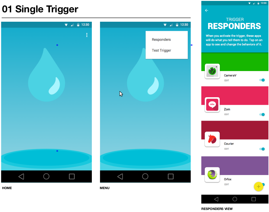
This design is based on the idea of "Ripple", as in a single drop into water triggering a ripple across the whole surface of the water.
panic_design_patterns_v2-1.png (102 KB)
panic_design_patterns_v2-2.png (139 KB)
Replies (18)
RE: simple panic trigger app - Added by hans about 2 years ago
I like the Ripple idea, that works for me. The background looks nice, but I didn't get it until I read the email thread. I think the rippling in the water needs to be more pronounced, like having more concentric circles to more clearly look like a ripple:


About the list of responders, I think each item is too big. That will mean that users will basically always scroll on regular phones (i.e. 3-4", Moto G, etc), and frequently on big phones too. And the big color bars for each app just seem to add visual clutter without adding useful information. I don't think that people have a hard time distinguishing 5-10 apps in a list view when there is already the app icon and name.
ripple.jpg (2.24 KB)
the-ripple-effect.jpg (47.7 KB)
RE: simple panic trigger app - Added by hans about 2 years ago
Now that I'm putting together this app, I think that it makes sense to have the responders screen as the single, main view in the app. That way the user can see which apps are going to be triggered before triggering. As long as it does not distract from the process of triggering.
RE: simple panic trigger app - Added by n8fr8 about 2 years ago
I like ripple, but I don't want it to seem like a gimmick, or one of those live wallpapers.
Maybe we just need a simple clean mechanism, like the iPhone screen unlock, or something with a nice kerchunk feel to it? Like pulling a fire alarm (break glass in case of emergency). "ICE"
I think the current panic swipe is quite good, actually, it is just the icon that is most problematic.
RE: simple panic trigger app - Added by hans about 2 years ago
I agree, we need a good icon to represent triggering a panic. The radioactive symbol is too sci-fi ;).
I have already got the Courier/SecureReader "Swipe to Trigger" UI stuff wired up in this app, I think it works well. Its here: https://github.com/guardianproject/ripple
RE: simple panic trigger app - Added by carriestiens about 2 years ago
Re: About the list of responders, I think each item is too big. That will mean that users will basically always scroll on regular phones (i.e. 3-4", Moto G, etc), and frequently on big phones too. And the big color bars for each app just seem to add visual clutter without adding useful information. I don't think that people have a hard time distinguishing 5-10 apps in a list view when there is already the app icon and name.
Yeah. I was experimenting with ways to make the interface look less like a settings screen. The idea was that the color bars could also be the feature images of the apps. I do agree with you about the scroll. It is probably more important to be able to get a better overview and to see more receivers in this view (especially on smaller phones).
Re: Now that I'm putting together this app, I think that it makes sense to have the responders screen as the single, main view in the app. That way the user can see which apps are going to be triggered before triggering. As long as it does not distract from the process of triggering.
For the single trigger app, I was thinking that the trigger should be front and center. It's basically what you open the app to do. The view and/or configuration of the responders would be secondary, which is why they are located in a different view. With this kind of design, we would need an onboarding step where the users sees the default configuration and can change it, before they are taken to the home screen of the app.
If we collapsed the trigger and the responders into a single main view (similar to the mockups from the last round), the biggest question is how do users trigger? Rather than opening the app and swiping, they would need to open the app, tap a button, then swipe. It adds another tap, which may not be bad, but we should consider whether that's something we want to do.
RE: simple panic trigger app - Added by carriestiens about 2 years ago
On the visuals, I agree that the radioactive icon does not work. It's tricky to summarize a panic action in one icon since panic encompasses sending alerts, hiding things and wiping data and apps.
I thought the 'drop' icon was a good solution for a generic panic action because it can allude to 'clearing your record', 'covering your tracks' and/or 'wiping your data'. It's also just a generic way of communicating cause and effect. I don't think we have to get gimmicky on the visuals, and maybe not even too literal by showing the ripples.
Other visual options for the trigger app:
- go super abstract and simple and use a circle
- 'magic' sparkles (something like ![]() or
or ![]() )
)
RE: simple panic trigger app - Added by n8fr8 about 2 years ago
I have also been thinking about this as more of a chain reaction, as well as a reaction to an emergency. This led me to think about Rube Goldberg machines.
I agree that "cause and effect" is the core message, not necessarily clearing, wiping, etc, because it is up to the receive apps to choose their actions.
RE: simple panic trigger app - Added by hans about 2 years ago
I like the 7-point star as a panic icon:  . Its simple and clear and abstract. It seems really hard to make an icon that is evocative of a panic button since this whole concept here is pretty abstract. I like the idea of representing "cause and effect" somehow, that is really the essential idea of this whole panic system.
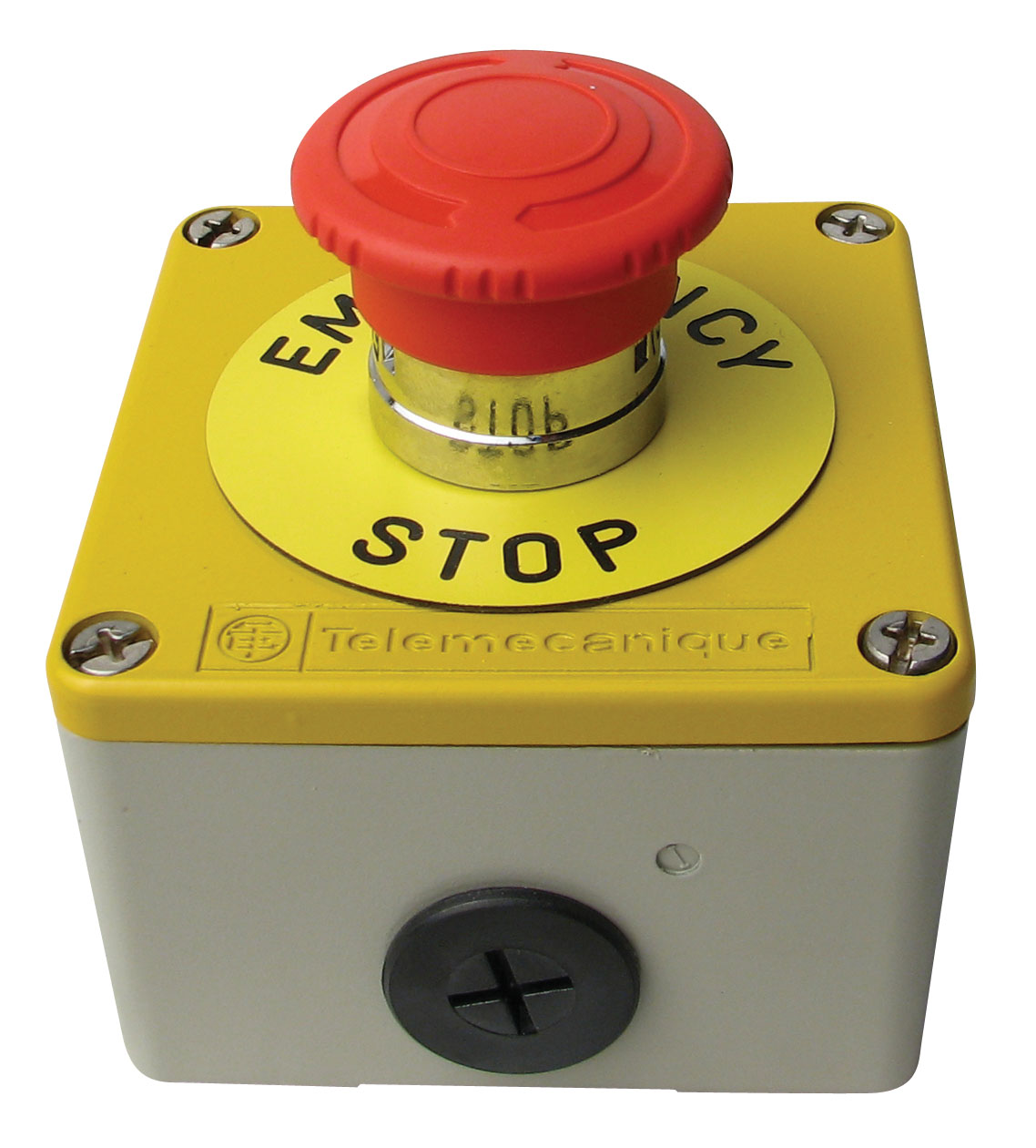
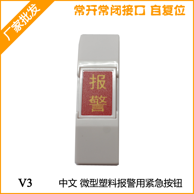
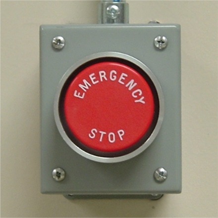
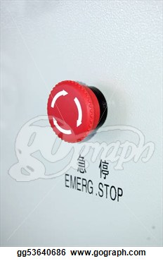
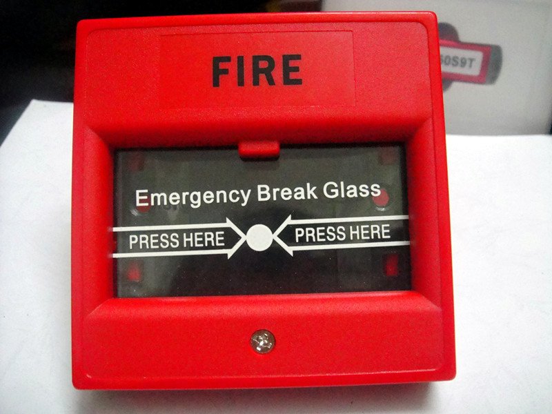
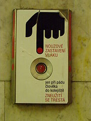
Though it seems a bit overwrought, the big red button is a very common, cross-cultural icon. It is literally used in factories, machines, metros, cars, etc as an emergency stop. Here's a quick survey:


panicstar.png (8.47 KB)
big-red-button.jpg (172 KB)
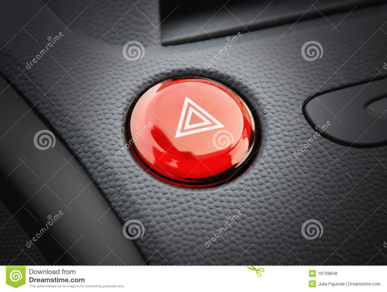
car-emergency-button.jpg (126 KB)
EmerFacShutOff.jpg (36.1 KB)
chinese-emergency-button.jpg (167 KB)
emerg-stop.jpg (17.5 KB)
emergency-stop.png (261 KB)
fire-break-glass.jpg (84.6 KB)
metro-emergency-button.jpg (9.63 KB)
lift_emergency.png (101 KB)
RE: simple panic trigger app - Added by hans about 2 years ago
Here's a quick sketch of what an integrated screen that has both the trigger button and the config on a single screen. The idea with this trigger app is to have extra clicks so that it is impossible to mistakenly trigger it.
ripple-sketch-first-button.png (26.1 KB)
RE: simple panic trigger app - Added by n8fr8 about 2 years ago
http://www.damninteresting.com/this-place-is-not-a-place-of-honor/
"This place is a message… and part of a system of messages… pay attention to it!Sending this message was important to us. We considered ourselves to be a powerful culture.
This place is not a place of honor…no highly esteemed deed is commemorated here… nothing valued is here.
What is here is dangerous and repulsive to us. This message is a warning about danger.
The danger is in a particular location… it increases toward a center… the center of danger is here… of a particular size and shape, and below us.
The danger is still present, in your time, as it was in ours.
The danger is to the body, and it can kill.
The form of the danger is an emanation of energy.
The danger is unleashed only if you substantially disturb this place physically. This place is best shunned and left uninhabited."
RE: simple panic trigger app - Added by hans about 2 years ago
Or another icon direction: the hazard button, like in cars. That double-triangle icon stands out nicely.
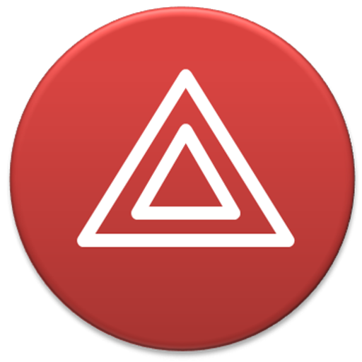

triangle-button-hazaard.jpg (28.3 KB)
round-button-hazard.png (73 KB)
RE: simple panic trigger app - Added by hans about 2 years ago
some danger icons that I thought were interesting 


RE: simple panic trigger app - Added by carriestiens about 2 years ago
I think you're right about the cross-cultural familiarity of the red emergency button. The symbol that stands out to me the most of all of these is the triangle hazard button. I like that its form is different than what is typically seen with panic buttons, but that we can still use the red color. Also, the double outline ties somewhat into a ripple effect. That may be a stretch .. but for what it's worth, there it is. :)
Also, on your mockup, Hans -- I think that will work. We probably will need some kind of tooltip to tell users to tap on the red icon to activate the trigger. It doesn't seem like it will be super obvious at first glance. But, I think once they know, it's not a problem at all.

RE: simple panic trigger app - Added by hans about 2 years ago
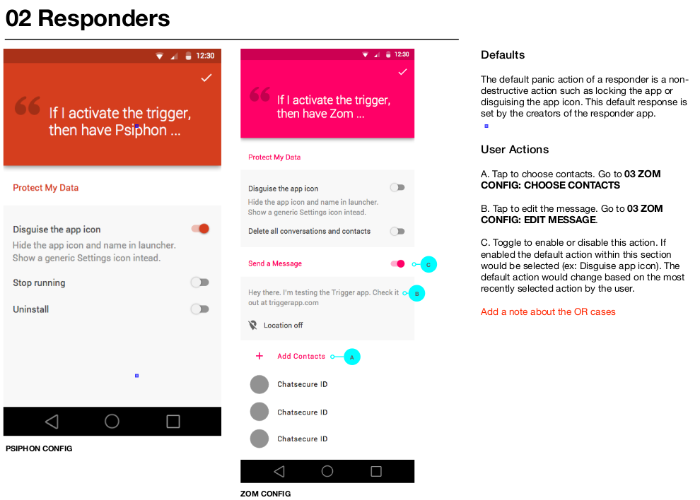
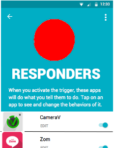
One thing I'm still struggling with conceptually is how to represent the default responses to the user. For example, in the trigger app, I think it should show the user all of the apps that it will send to, including ones that are not configured and will just give their default response.
Here's how I think it should be handled, based on our discussion today and Carrie's drawings:- all panic responders show up in the list
- all responders in the list have a switch next to them to enable/disable
- responders that have more than just a default, e.g. can "connect", have an "Edit" label on them. Clicking on them opens the panic setup.
- responders that only have a default, non-destructive have no "Edit" label and are not clickable
This screen shot is close to what I redescribed, it's only missing the "Edit" label: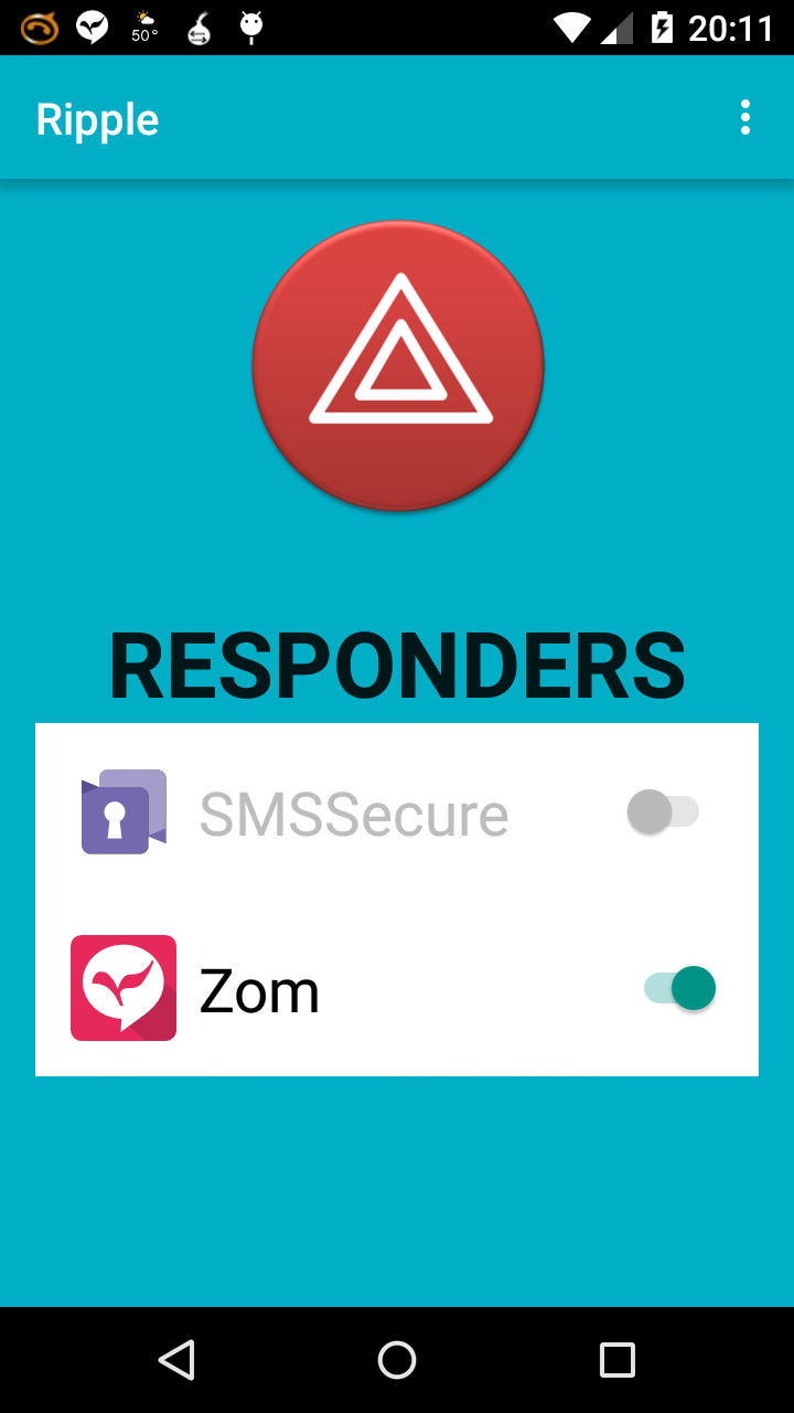
RE: simple panic trigger app - Added by hans about 2 years ago
A couple more things:
- if an app is non-configurable, then it defaults to "lock" and that is shown instead of "Edit"
- list sorted to have disabled ones at the bottom
RE: simple panic trigger app - Added by hans about 2 years ago
Here is the white outline version of the "hazard" icon from cars, I think it could work as a general purpose panic icon:
ic_panic_lg.png (13.3 KB)
RE: simple panic trigger app - Added by n8fr8 about 2 years ago
I was thinking we might create both a "Ripple" version and a "Hazard" version of the trigger app, and see which people like more. (not to create more work, but in the gradle world, that would just be a different build flavor)
RE: simple panic trigger app - Added by hans about 2 years ago
Well, Hazard is more or less already there:
https://dev.guardianproject.info/boards/21/topics/379
(1-18/18)