A plan to implement first step of the swap UI
Added by pserwylo over 3 years ago
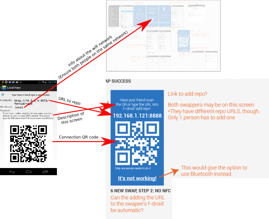
After all the good work from _hc, pd0x and whoever else worked on the kerplapp stuff, the next step is to start getting the UI to look like carries mockups. Here is the first screen I plan on re-doing, so that it matches the design. On the left is the current view from F-Droid, and the right is carries mockup.

This is the first one I chose, because it is the one which will probably be seen the most, and is one of the most important ones. In addition to purely UI stuff, I'm also keen to make it so that we can indeed just provide an IP address and port, and then the other client will try and infer the rest of the path (i.e. "/fdroid/repo") on behalf of the user.
The next screen, in terms of importance, and also perhaps simplicity, would be the wifi-connection screen (3 NEW SWAP, STEP ONE).
p.s. I'll be up bright and early if anybody is scrumming Thursday morning (Wednesday arvo).
step-one.png - Current and future UIs (145 KB)
Replies (2)
RE: A plan to implement first step of the swap UI - Added by carriestiens over 3 years ago
This sounds like a good plan. Peter, I'll be sure to get you the illustrator file for the most current design of this screen. The one you have shown above is the original version. It's been updated since. The basic guts are pretty much the same.
RE: A plan to implement first step of the swap UI - Added by hans over 3 years ago
Sounds good to me.
(1-2/2)