Swap Workflow
Added by carriestiens over 3 years ago
Hey guys, I was able to make a lot of progress on the swap workflow and basic structure of how 'swap' operates within F-Droid for new and previously connected swap repos. I've also worked to account for fail scenarios. The sketch below shows the Wifi + NFC scenario. This also opens up a lot of questions on my end, as well as discussion.
The main goals of this approach are:
- Make decisions easy for users. Suggest the transport method that is the easiest and has the best chance of success.
- Give users the best possible chance of succeeding.
- Fail beautifully. Know when a swap fails or may fail, and offer the users another transport option.
Here's an outline of the design decisions and outstanding questions:
Note: These mockups reflect the SwapER and SwapEE views; though only 1 users has to initiate the swap.
0. Drawer Menu & General Structure
- Available vs. Nearby: Will repos detected via bonjour and bluetooth automatically show the apps in that repo, or, is there an extra step?
- Because Swap repos are temporary, they will be sub-pages of swap rather than a top level repo listing. This also helps make sense, structurally, of where a new swap is located.
1. Swap Home
- Educate users about swap; The 'New Swap' button would remain, while the description text would disappear after the first 3 uses of Swap.
2. New Swap, Step 0 (turn on your wifi)
- Give the user a primary choice (wifi); then secondary option (bluetooth)
- User would only see this screen if his/her wifi is off; though, it's important for people to know that a private network or hotspot are the best networks to use; so we may want to either include that info on the next screen, or always show this screen.
3. New Swap, Step 1 (join the same wifi)
- The main goal of this screen is to make sure people know to get on the same wifi, and to make that as easy as possible. I think we should provide the QR scan as an option for connecting to the same wifi, but keep it as a alternative; since joining the same network from your phone settings is probably more familiar to most users, and because there are quite a few potential fail cases with the QR scan, depending on the barcode scanner people are using.
- Maybe people can tap the QR code to make it larger
- We could link to the wifi settings (this would be helpful only if the swapER need to switch networks)
4. New Swap, Step 2: NFC
- This screen is only shown if the user has NFC; there needs to be an easy and clear opt out in the case that the swapEE doesn't have NFC
- Both users need to know that their NFC needs to be on. (This seems obvious, but if people aren't familiar with using NFC, they may assume that it's always on, and that it should just work, without doing anything)
- I think we should automatically turn the NFC on for users when they get to this screen. Showing 'Your NFC is on' is meant to imply that NFC needs to be on, in the case that the swapEE doesn't have this screen open.
- After a NFC-Wifi swap, can we detect if the swapEE has F-droid installed?
If they do have F-Droid, we will show them apps in the swap they just received. If they don't have it, they would be directed to the bootstrap URL, with the 5 steps, where they can download F-Droid first.
- Overlay on 'My Swap' vs. separate screen -- the overlay is meant to give a hint to the ability to just touch phones together from the swap home screen. Maybe we provide a 'tip' about that functionality after the first or second use.
5. New Swap Success
- We could have a few different fun success messages that we cycle through with different swaps to make people feel happy :)
- We need to make it clear that the apps that we just swapped need to be installed for the person to actually have them as their own
- Users can double tap as a shortcut to install; this would make getting the apps much easier, because for the apps people know they want, they would have to tap in to open the details, then tap install, then go back and repeat the process for every app they want to install.
- We'll need to display malware detection warnings on this screen as well. Also, if there is suspicion about an app, we should either not allow the double tap to install, or we should pop-up a warning and ask them if they are sure they want to install it.
6. New Swap, Step 2: No NFC NEEDS WORK
- Both users may be on this screen; or only one may be on this screen.
- If people are not using the QR code, and are instead typing in the URL, they can enter the URL into the 'add repo' screen within f-droid or into a browser— is that right?
- It may be a bit confusing to make the language switch from 'swap' to 'add repo'
- Because Wifi can fail without feedback, we need to give an opt out of Wifi if it's not working; this is what the 'It's not working' link is meant to do. Perhaps there's a smarter way..
- Is there anything we can do in the background to make this better?
7. Swap Repo Views
- Show how the connection is made (same wifi via bonjour or bluetooth)
- Is there a case when the apps won't automatically show up, if a previous connection has been made?
Bluetooth Questions:
If BT functions as a one-way file transfer, can the repo's be swapped?
Upcoming things to consider
a. Views for the swapEE receiving a swap in various states (fdroid open & not on new swap screens, fdroid open & on new swap screen, fdroid closed)
b. Malware / Suspicion detection
c. Content & layout for App details screen

swap_workflow_v2.png (306 KB)
Replies (17)
RE: Swap Workflow - Added by hans over 3 years ago
Looking good! A couple of technical answers to the questions that came up:
- Repos available via bonjour/bluetooth that have been used before will automatically show up, if they have not been used before, the user needs to do a one-click "you've never seen this repo before, add it?" for TOFU/POP.
- fdroid can detect whether anyone has connected to the local repo via wifi, so we can use that to prompt the user to try something else if no one has connected yet.
- fdroid can tell whether it has connected to a repo yet, so we can use that to prompt the user to try something else if fdroid was unable to connect to the repo.
RE: Swap Workflow - Added by carriestiens over 3 years ago
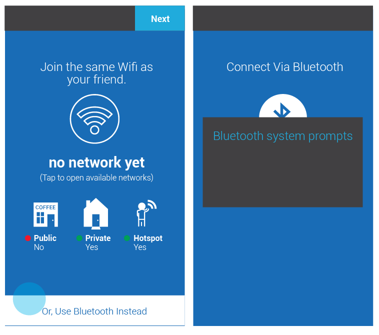
Hello! I revised the swap process based on feedback from our last meeting, and some testing with people that are unfamiliar. Below is an overview of the feedback. The mock-ups reflect improvements.
Testing Feedback:
- Have clear initiator and receiver actions and/or flows: "One person needs to initiate" / "One person needs to scan"
- Link to QR scanner
- Wifi icon will turn solid when wifi is on
- Link to show available wifi's "Open available wifi" Always open the QR code in the browser Remove the wifi QR code section, and just link to the available wifi networks. It's confusing.
- Do both people 'start a new swap'? Yes, but let's design it in a way that works if they both do, but doesn't require it if they don't (which is already technically happening)
Other improvements:
- Available repos are listed in one menu in the side drawer
- The tip for which wifi network has been made visual (Side question: Is saying 'no' to public wifi's too extreme? We could say not recommended or something less black and white.)
- Solid background and dedicated process screens, rather than an overlay
- Consistent placement of buttons for moving through the swap process
- The previous 'Turn on Wifi' screen has become part of the 'Join the same Wifi as your friend' screen, as a separate state. This simplifies the process and solves the problem: "If the wifi screen is skipped, where do we show the tip about using a private network or hotspot?"
- Initial mock-up of what users would see if they chose 'Use Bluetooth Instead'
Not shown:
- Prompts for the wifi 'fail without notice' (This is when f-droid automatically detects if a repo has been connected after 1 minute of trying)
- First-use scenarios (create your swap)
- First-use swap scenarios (Bootstrap f-droid screen for first 3 times)
- Swap preferences
- Views for the swapEE receiving a swap in various states (fdroid open & not on new swap screens, fdroid open & on new swap screen, fdroid closed)
To discuss:
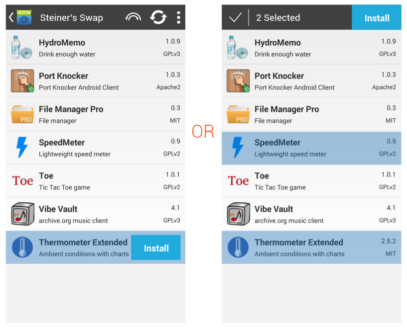
- Tap hold interaction for a quick install
- App details (For now, I just included the information we currently are showing. Although, I believe I haven't yet shown the license and 'Internet' or 'Reading' that are displayed in F-Droid now.)
- Malware screens


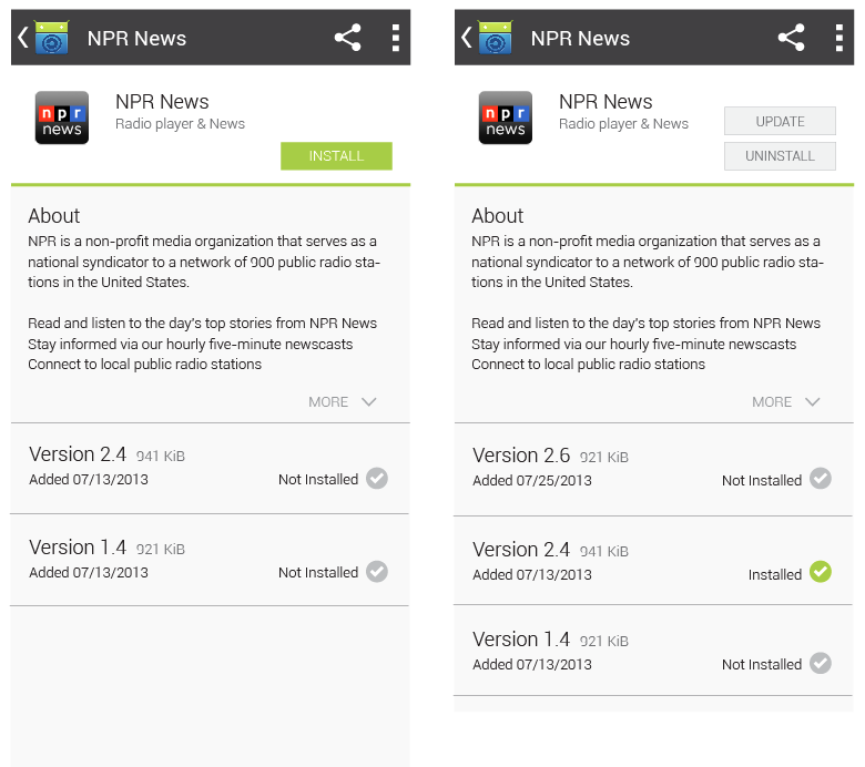
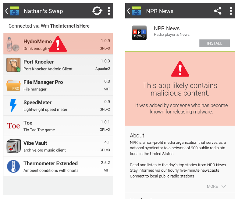
v3_overview.png (88 KB)
v3_swap-process.png (95.7 KB)
v3_app-details.png (54.4 KB)
v3_malware.png (104 KB)
v3_choose-bluetooth.png (45.3 KB)
RE: Swap Workflow - Added by carriestiens over 3 years ago
So, I looked to see if I could find any common/standard design patterns for process screens, that we should comply with for the swap process screens. Android does not yet have strict standards about this. They outline everything in terms of structure—http://developer.android.com/design/patterns/app-structure.html. However, they don't outline cases for temporary processes. (I imagine at some point they will.)
We can draw off of what other people are currently doing for sign up and first-use introduction screens: http://www.android-app-patterns.com/category/signup and http://www.android-app-patterns.com/category/start-screen
My takeaway is that placing the action button in the top right hand corner is a good move, because it is consistent, and will be visible on various screen sizes, regardless of how much info we have on each screen. We could add the 'up' navigation button to these screens to place it within the app structure. We have a couple options with this:
- a) we could assume that these screens are all on the same level of structure; the 'up' button would always return to the Swap Home screen
- b) or, we could say that each step you take, takes you deeper into the structure; the 'up' button would, then, end up functioning like a back button, because it would take you 'up' one screen at a time
My vote is a) since this workflow is more like a 'choose your own adventure' scenario than a one-way linear scenario.
The other thing we can do to make this experience more intuitive, is to enable 'swiping' between these screens. I think I would do this in addition to the 'next' button as an added bonus. ;)
-c
RE: Swap Workflow - Added by carriestiens over 3 years ago
RE: Tap hold interaction as a shortcut for installing
Here are the android guidelines for long press: http://developer.android.com/design/patterns/gestures.html
"Long press: Enters data selection mode. Allows you to select one or more items in a view and act upon the data using a contextual action bar. Avoid using long press for showing contextual menus."
According to that, we should go with the second option in the image below:
Screenshot 2014-05-07 12.10.39.png (85.4 KB)
Screenshot 2014-05-07 12.10.39.png (85.4 KB)
select.png (85.4 KB)
RE: Swap Workflow - Added by carriestiens over 3 years ago
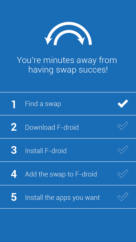
Here's a quick mock-up of the swap website 'as is' but skinned to fit within the swap design. I haven't thought through other options we could have for this screen (like showing the apps within the swap or other apps people could download). That may need to be part of a round 2.
swap_website.png (36.2 KB)
RE: Swap Workflow - Added by hans over 3 years ago
Looks good to me. @carrie, any thoughts on how to incorporate a list of apps to install without making it dominant? Perhaps a link to another page that is the list of apps that are downloadable.
RE: Swap Workflow - Added by carriestiens over 3 years ago
hans wrote:
Looks good to me. @carrie, any thoughts on how to incorporate a list of apps to install without making it dominant? Perhaps a link to another page that is the list of apps that are downloadable.
Do you mean the list of apps that are in a swap, or just a featured list?
RE: Swap Workflow - Added by hans over 3 years ago
Yes, all the apps that are shared via the swap. It shouldn't be highlighted on this page since we want to encourage people to use the swap process for all of its benefits. But we also want to easily provide lots of options to make sure that people can get apps to each other when they need to.
RE: Swap Workflow - Added by carriestiens over 3 years ago
Hans, if the 'swapee' has the web page open in the browser, but doesn't have F-droid installed, will the apps that are in the 'swapers' repo show up?
And -- if they (the swapee) does not have F-droid installed, can they still download the 'swapers' app repo?
RE: Swap Workflow - Added by hans over 3 years ago
This is direct download like in Paik, so the swapee does not need FDroid at all. The swapee will see the whole list of apps from the swap, and can download and install any individual app from this list just by clicking on the link in that webpage.
RE: Swap Workflow - Added by carriestiens over 3 years ago
hans wrote:
This is direct download like in Paik, so the swapee does not need FDroid at all. The swapee will see the whole list of apps from the swap, and can download and install any individual app from this list just by clicking on the link in that webpage.
So really, we don't need any of the other information that's there currently. Users don't need to download and install Fdroid, or add the swap to F-droid. They simply need to choose the apps they want to install. Is that right?
RE: Swap Workflow - Added by hans over 3 years ago
No no no... what is there is good, and should be the highlighted bit of the webpage. The idea is to provide a backup method of direct install via that webpage. It is for the "if all else fails" use case.
RE: Swap Workflow - Added by carriestiens over 3 years ago
hans wrote:
No no no... what is there is good, and should be the highlighted bit of the webpage. The idea is to provide a backup method of direct install via that webpage. It is for the "if all else fails" use case.
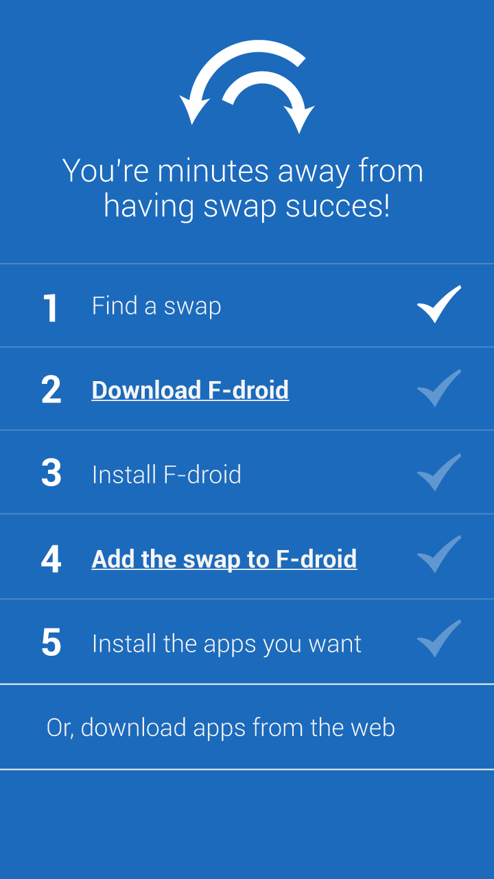
Hey Hans. Okay. We can do something like the image below. I'm just curious, from a technical standpoint -- if the user can download directly from here, then they actually don't need to have f-droid installed at all. Is that right? Or am I missing something? I guess that we probably want to encourage people having the F-droid app, so they can get updates. Just curious.
s5.png (44.7 KB)
RE: Swap Workflow - Added by hans over 3 years ago
Yes, then can install by downloading directly from this page, but using FDroid provides a better user experience, like a regular app store, and provides automated updates and auditing.
RE: Swap Workflow - Added by carriestiens over 3 years ago
Hey guys,
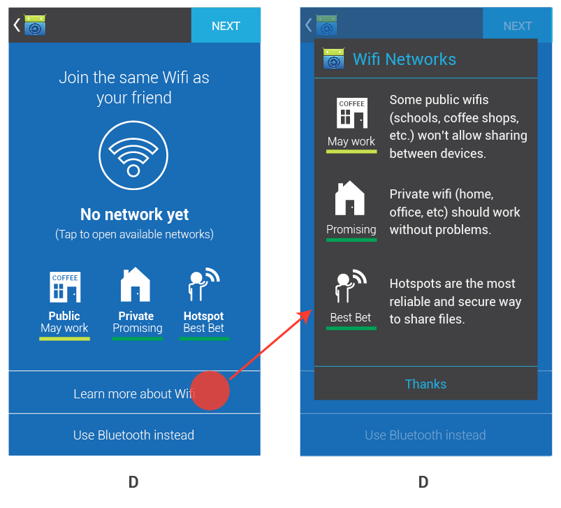
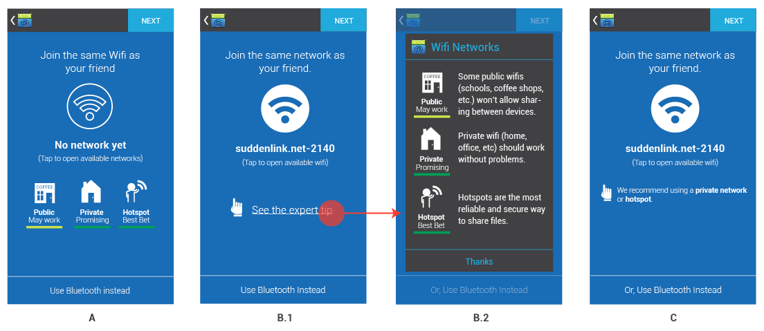
I'm circling back to the initial wifi screen, because in our last discussion of swap screens, there were some questions about the way we're displaying the Wifi options. The original intention was to create a 'glance-able' screen that would encourage people to use a private wifi or hotspot when swapping via wifi, since it's common for public internets not to allow the sharing of files between devices. The graphics in the original mock-up looked too much like 'online' / 'offline' status symbols. I changed the graphics and wording so that the 'public' wifi wasn't cast completely out of the picture. Now, you can see that public wifi 'may work'. Though a private network or hot spot is likely to be a better bet.
The whole purpose here is to avoid a fail scenario of people trying to swap over a public wifi that won't allow it. If people want to learn more, they can select 'Learn more about Wifi'. This would pop up a modal with info about each wifi option. I think we should keep the icon illustrations on the main screen (rather than just linking to more info with text), because after testing with a few people around the office, it was clear that they are more likely to take in the information if there are pictures. The first image below shows this solution. The second image shows you the other options.
wifi_d.png (76.2 KB)
wifi_opts.png (73.9 KB)
RE: Swap Workflow - Added by hans over 3 years ago
this looks much better. One little detail: ideally the icons would be a bit more international, but these are good for now and will work well in a lot of contexts. One little change that would internationalize them more is changing the word "COFFEE" on the public icon to "CAFE". "Coffee" is only an English word, but "Cafe" is a word in many languages including English. Or maybe instead of a word there it could be a cup and a fork/knife or something like that.
(1-17/17)