This is an extension of the technology implemented for Local Data Transfer. This wiki page will track less of the technical details, and more of the UI/UX related stuff.
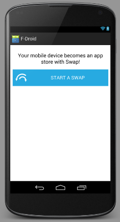
The following screenshots are from the actual layout files being worked on in the Android client. The views were rendered by Android Studio's rendering stuff, whcich as far as I am aware, is essentially compiling and rendering as they would be on the real device (so they are quite accurate).

I struggled to find a way to make the swap icon go to the left of the image. It seems that the only solution people have online for aligning an image next to the text, and then centering the text + image combined is to not do it at all. Alternatives seem to be: put the image above the text, and place the image on the left with padding (which is what I've done here). This uses the "drawableLeft" attribute of the button to place the image on the left.
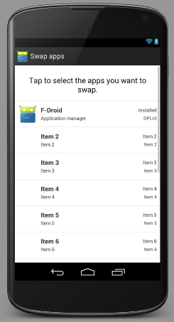
It will use the exact same list item view as the main list of apps. My concern is that we don't actually have infomration such as "Summary" and "License" available for installed apps, only for those in a repo we know about. The current Local Data Transfer implementation does away with the extra info, showing instead the app icon + name + package. In the long run, we should probably try a combination of:
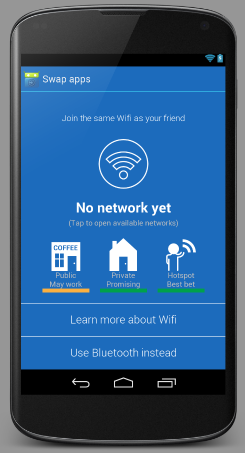
The first view I'm implementing the logic for. It is using the same WifiStateService stuff that the Local Repo stuff uses, so that the UI is refreshed automatically when the WiFi network changes. Still need to have some feedback for the "Connecting..." state. Also, the buttons down the bottom of the screen need to have an additional style for when they are pressed.
I must admit, the orange/green still feels a little like a button, but other than that, looks great. Also, on smaller screens, the wifi icon tends to get so small that it may as well not be there.
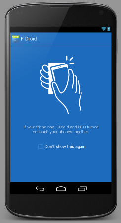
Not a particularly complex view.
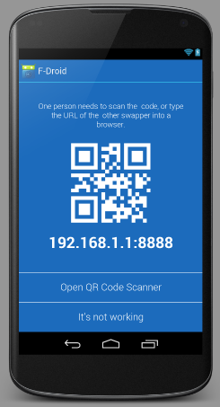
Again, buttons need to have relevant styles for when they are pressed.
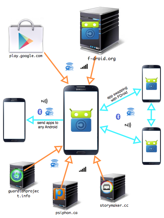
Here is a diagram of the complete app swapping ecosystem:
(NOTE: It would be cool if this diagram also included mirrors of the servers - both those hosted by the same owners (e.g. GP repo on S3) and those hosted by 3rd parties (e.g. how debian repos are mirrored around the world).
